Why Twisted Pear
A simple explanation that in no way explains the depths behind it.
8/15/20241 min read

Anyone familiar with elementary statistics has been introduced to the scatter diagram. This is where score pairs are plotted on a graph. Usually you have been shown that score pairs almost always form an ellipse, and that if the ellipse is narrow, the correlation is high, but if the ellipse is circular, the correlation is zero.
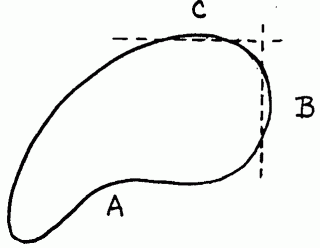
However, when there is a systematic relationship between two variables below a threshold, and no systematic relationship is found above the threshold. Its scatter diagram is a union of an ellipse with a circle. It should now be obvious how the twisted pear correlation got its name; its scatter diagram looks exactly like a twisted pear.
As it happened, while considering a name for this blog I stumbled upon a study "IQ, Creativity and the Twisted Pear" and the rest as they say ...
Twisted Pear
Exploring how different IT projects run.
© 2024. All rights reserved.